Saturday, May 9, 2020
 |
A type designed in a grid, like on display panels
Type is not only printed. There were always and still are a number of forms of type versions which function completely differently. Even very early in the history of script there were attempts to combine a few single elements into the diverse forms of individual characters and also efforts to construct the forms of letters within a geometric grid system. The “instructions” of Albrecht Dürer are probably most well-known.
But although designers of past centuries assumed the ideal to basically be an artist’s handwritten script, the idea which developed in the course of mechanization was to “build” characters in a building block system only by stringing together one basic element — the so-called grid type was discovered, represented most commonly today by »pixel types.« But even before computers, there were display systems which presented types with the help of a mechanical grid display, like the display panels in public transportation (bus, train) or at airports and train stations.
In a streetcar, I met up with a modern variation of this display which reveals the name of each tram stop as it is approached. This system was based on a customary coarse square grid, but the individual squares were also divided again diagonally in four triangles.
In this way it is possible to display slants and to simulate round forms more accurately as with only squares. The displayed characters still aren’t comparable to a decent typeface — on the contrary, the lower case letters are surprisingly ugly — but they form a much more legible type than that of ordinary [quadrate] grid types.
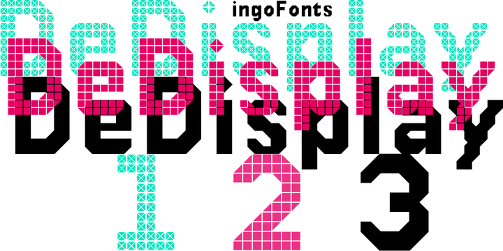
DeDisplay from ingoFonts is this kind of type, constructed from tiny triangles which are in turn grouped in small squares. The stem widths are formed by two squares; the height of upper case characters is 10, the x-height 7 squares.
DeDisplay is available in three versions: DeDisplay 1 is the complex original with spaces between the triangles, DeDisplay 2 forgoes dividing the triangles and thus appears somewhat darker or “bold,” and DeDisplay 3 is to some extent the “black” and doesn’t even include spaces between the individual squares.
Friday, May 8, 2020
 |
Download Now
Server 1Download Now
Server 2Download Now
Server 3
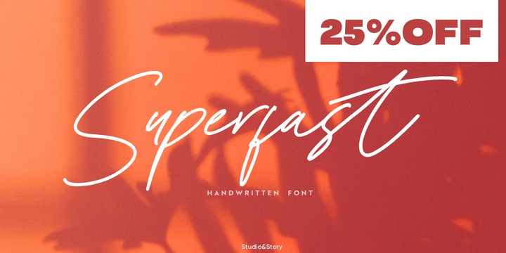
Superfast is a hand-written, flowing, script that will add a fast and sharp movement style to your projects. It charms you right at the beginning. If you are looking for a sensitive font that can respond to the vibe of your design, Superfast is the right choice. On the one hand it is elegant and luxurious, and on the other hand, trendy and modern.
Created for beautiful logos, branding projects, posters, blog posts, social media, campaigns, advertising, web design and more!
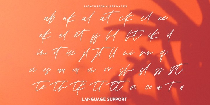
Superfast contains upper and lowercase characters, numerals and a large range of punctuation. Its
OpenType features include 41 Ligatures and a large number of alternates, which make everything you write authentic and flowing.
 |
| Download Superfast Fonts Family From Studio&Story |
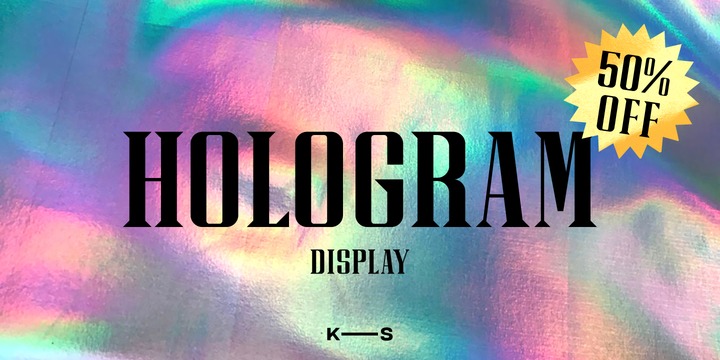
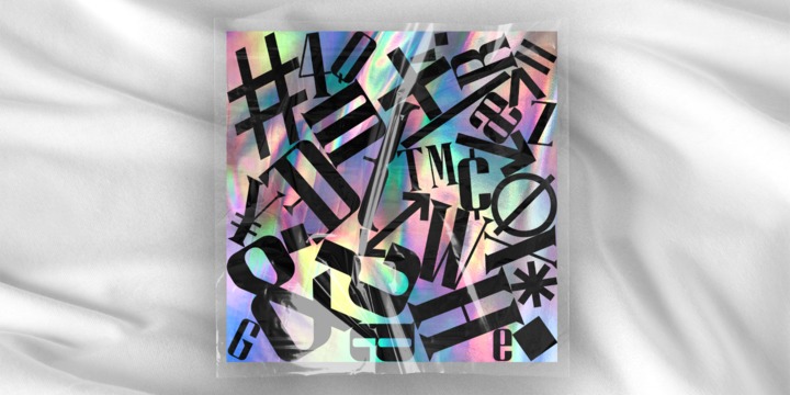
Hologram is a font inspired by a combination of the future and the past. The intention was to design a font that was most effective when applied to Largely Displayed text like Headings, rather than for smaller extended bodies of text.
There are 3 distinctive styles offered in the Hologram font family. Each style contains over 350+ Glyphs per style with support for up to 26 Languages as well as specialised kerning & spacing.
- Display Sans: This style is the cleanest of the 3 fonts. There are no serifs attached to the ends of the strokes, although the stroke weight is varied from thick to thin depending on the letters.
- Display Serif: This style contains modern serifs at the ends of most character strokes that give more structure to the shapes. A majority of the serifs are horizontal in direction with few characters containing vertical serif details.
- Display Wedge: The most Bold of all is the Wedge Serif style offered. Featuring thick and thin triangular serifs at the ends of character strokes. This style is most effective in Large Displays & Titling uses.
Designed by KAZER STUDIO

"Engin" is a sharp and futuristic font. It has rigid structures and broken forms. It's a font that will be used in 2132. Wide shapes and non-standard patterns create a strong image and texture of the text.
Engin supports Basic Latin and Extended Latin, Cyrillic — in total about 90 languages are supported.
The font has one Regular weight, all uppercase. Engin font was designed by Viktor Pesotsky.
Thursday, May 7, 2020
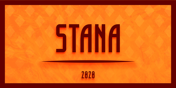 |
Stana is clean and tall display font. There are more than 150 glyphs included.
