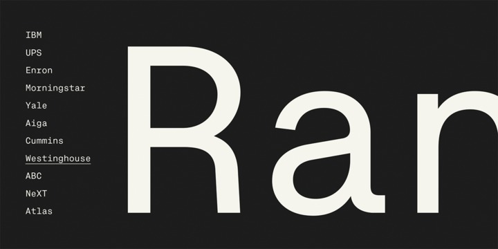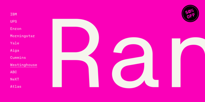
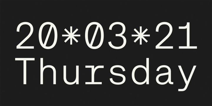
Approach Mono is the fixed width version of Approach. A utilitarian low contrast font, a bit mechanical but plenty of character. This version shares its main features with the original one, but it has a more prominent and visible punctuation. The more obvious use of a mono would be in tables, programming code or “in progress texts”, but not just that. Approach Mono can be used in the modern communication, bringing an aseptic voice to brochures, advertising, identities and any other piece of communication.
Showing posts with label approachable. Show all posts
Monday, November 23, 2020
November 23, 2020
BY
Reva
0
Comments
Tags
alternates
,
american
,
approach
,
approachable
,
bauhaus
,
branding
Tuesday, July 21, 2020
July 21, 2020
BY
Reva
0
Comments
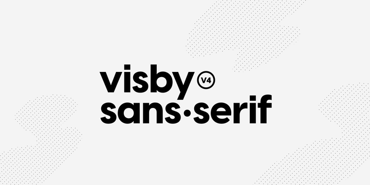
Friendly in lowercase; sophisticated in capitals. Visby CF is a geometric font family inspired by the stark beauty of the Arctic. Straight lines and sharp corners mesh with subtle humanist influences, giving Visby a blend of precision and warmth. Includes Latin and Cyrillic scripts.
Visby CF pairs well with contrasting softer typefaces, particularly text-friendly serifs like Artifex CF and Addington CF.
All typefaces from Connary Fagen include free updates, including new features, and free technical support.